Spend ten minutes on Awwwards or the FWA, and you will see a pattern. The winning sites mostly use the same tricks. Big asymmetric type. A bento grid. A scroll-pinned section. Some grain. Custom cursor. The trick is not magic. The trick is taste plus the willingness to commit to a few strong moves instead of forty weak ones.
We have shipped these 12 patterns in client work that did not cost anywhere near what an award-site studio charges. Most of them are CSS-only or use libraries that fit in under 30 KB. Here is the list, with the catch on each.
01 Why “Awwwards-style” is mostly the same five moves
The award-site look is not one thing. It is a small set of choices applied with confidence. Once you see the shapes, you can pick which ones fit your brand and skip the rest. None of these need a giant team. They need a designer who knows what to leave out.
For each pattern below, we will tell you what it is, why it works, roughly how hard it is to build, and the failure mode — the way the pattern goes wrong on most sites that try it.
02 The 12 patterns, with the catch on each
-
01
Big asymmetric typography with one bold word
A huge headline where one word breaks out in colour or weight. It tells the reader what the page is about in a single beat. Catch: only works if the rest of the page is quiet. If everything is loud, the headline disappears.
-
02
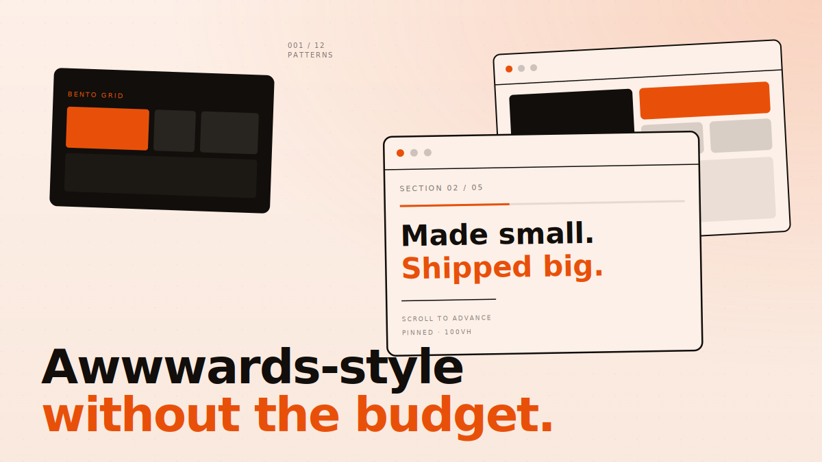
Bento grids — used sparingly
Mixed-size cards in a tight grid, one feature per card. Apple made this look mainstream. Catch: it is now everywhere, and most sites use it for content that does not need it. Rule of thumb: use a bento grid only when each card can stand alone. Otherwise it is just a grid.
-
03
Marquee scroll strips
A row of logos, words, or images that scrolls left or right forever. Cheap to build. Adds movement without distraction. Catch: the speed has to be slow enough to read. Most marquees online run too fast and become a blur. 20-30 pixels per second is the sweet spot.
-
04
Horizontal scroll-pinned sections
The page locks in place and content slides sideways as you scroll. Powerful for case studies and product walkthroughs. Requires GSAP ScrollTrigger or a similar library. Catch: hostile on touch devices unless you treat mobile as a separate layout. Always design the mobile version first, then the desktop scroll-pin.
-
05
Subtle grain and noise texture
A faint grain over the whole page makes flat colours feel physical. Single PNG or SVG pattern, one line of CSS. Catch: it has to be subtle. If you can see it on a phone in daylight, it is too strong. Aim for something a designer notices and a normal user does not.
-
06
Dark mode by default for design-led brands
Dark backgrounds let colour and image carry weight. They feel premium when done right. Catch: body copy on pure black is hard to read. Use a softened dark like
#110E0Bor#0E0E0Einstead, and make sure your text colour has at least 4.5:1 contrast. -
07
Custom cursor that does one job
A small custom cursor that grows on hover, or shows a label over media. Adds feel. Catch: never replace the cursor entirely on inputs and form fields. Lots of portfolios do, and the form becomes unusable. Show the custom cursor, but keep the system cursor for typing.
-
08
Reveal animations on scroll — 600 ms or less
Elements fade and slide up as they come into view. Standard move. Catch: too slow and the page feels sluggish. Most reveals should land in 400-600 ms with a
power3.outeasing. Always respectprefers-reduced-motion— some users get motion sickness from heavy animation. -
09
Numbered chapter marks for long pages
Treat your long page like a magazine. Each section gets a chapter number (Ch. 01, 02, 03) in mono font. Cheap, but it makes pages feel curated. Catch: only works if the chapter order makes sense. Random numbers on random sections feel arbitrary.
-
10
Mono-font metadata as a structural element
Use a monospace font for tiny labels, dates, and meta info. JetBrains Mono or IBM Plex Mono work. It signals “technical, intentional” without you saying so. Catch: use it only for short labels — not body text. Mono is hard to read in long passages.
-
11
Pull quotes that break the column
Inside long-form content, occasionally pull a sentence into a big quote box that breaks the reading column. Adds rhythm. Catch: the sentence has to be quotable on its own. Pulling a connecting clause out of context just confuses the reader.
-
12
Page transitions — or fake them well
A smooth transition between pages, where the content fades out and the next page fades in. Real transitions need a SPA router or the new View Transitions API. Fake transitions use a full-screen overlay that wipes across. Catch: fake transitions can hide real loading time and make the site feel slower. Measure before you ship.
03 How to combine the patterns without making a mess
Pick three. Not all twelve. We rarely use more than four of these on a single project, and never all of them. Award-winning sites look confident because they commit to a small set of moves and let those carry the page.
A useful framework: pick one structural move (bento grid, scroll-pin, horizontal slides), one typographic move (asymmetric headlines, mono metadata, oversized numerals), one texture move (grain, dark mode, custom cursor), and one motion move (reveals, marquee, page transition). Skip everything else.
04 What this gets you on a real client budget
A studio that ships an Awwwards-grade portfolio site charges anywhere from $40,000 to $250,000 for a single project. Most of that cost is not the design itself — it is the discovery, the strategy, the custom illustration, the WebGL hero, the dedicated dev team. If you strip those out and keep just the design language, you can build a site that looks 80% as good for 10-15% of the cost.
That is not a value judgment. The 80% looks great. It is enough to make a small team feel like a serious one, to make a startup feel like a brand, to make a portfolio feel like a studio. The 100% version costs ten times more because the last 20% is genuinely hard and very few people can do it.
For most sites, 80% is what you actually need.
05 Tools we actually use
None of these are exotic. The reason they work is because they are mature, well-documented, and free or cheap.
- GSAP for animation, including ScrollTrigger for scroll-pinning. Free for most uses.
- Lenis for smooth scrolling that does not break performance. About 8 KB.
- Funnel Display, Geist, JetBrains Mono, or any free Google font with a strong identity. Free fonts are not a tax on quality any more.
- Tailwind CSS or vanilla CSS — both work fine. Award-winning sites use both.
- Spline or Three.js if you must have 3D. Most sites do not need it.
06 Where to start this week
If you have a current site that needs a refresh, do not redesign it tonight. Pick one page — usually the homepage hero. Apply patterns 01 (big asymmetric type), 05 (subtle grain), and 08 (clean scroll reveals). Ship it. See how it lands with your audience. Then decide what to do next.
One pattern at a time, well executed, beats five patterns shipped half-broken. That is the whole game.
We design and build sites that punch above their budget.
If you want one of these patterns on your site — or all four strategically chosen ones — we do this every week. No lock-in, no agency-speak, just clean work shipped fast.